
Rooted in Nature Kiosk
Project Overview
An educational kiosk based in a science museum that teaches people of all ages about the responsibility of growing a plant and the steps needed to care for the plant to watch it grow.
Timeline
9 weeks
Software
Figma, Adobe Illustrator, Adobe Photoshop & Adobe After Effects
Project Type
Kiosk Educational Experience
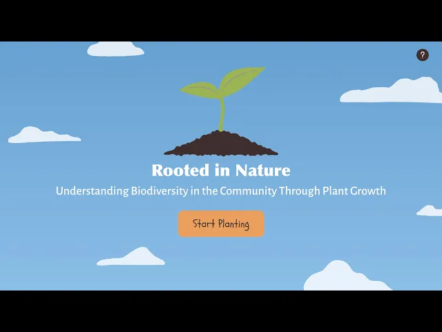
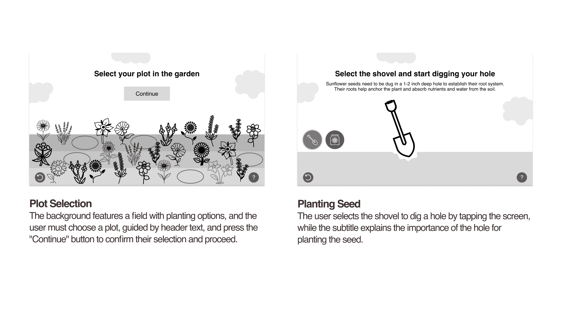
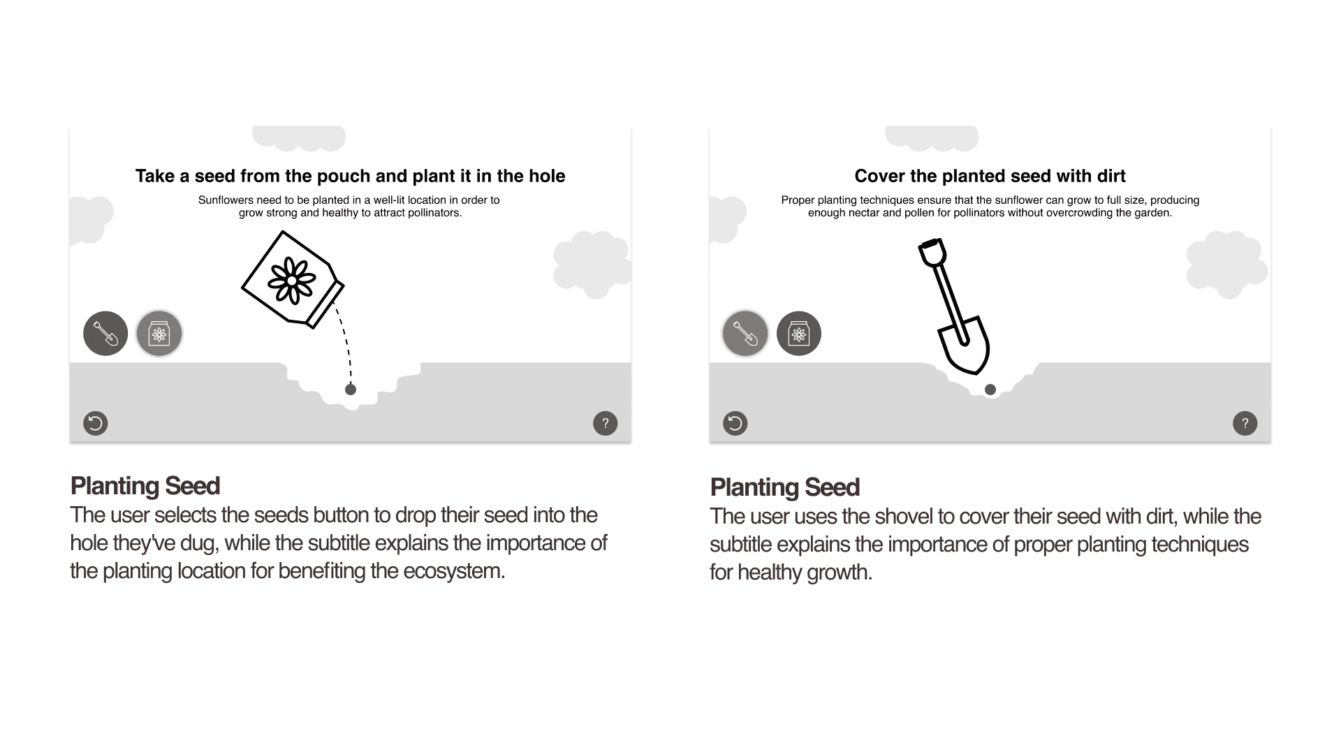
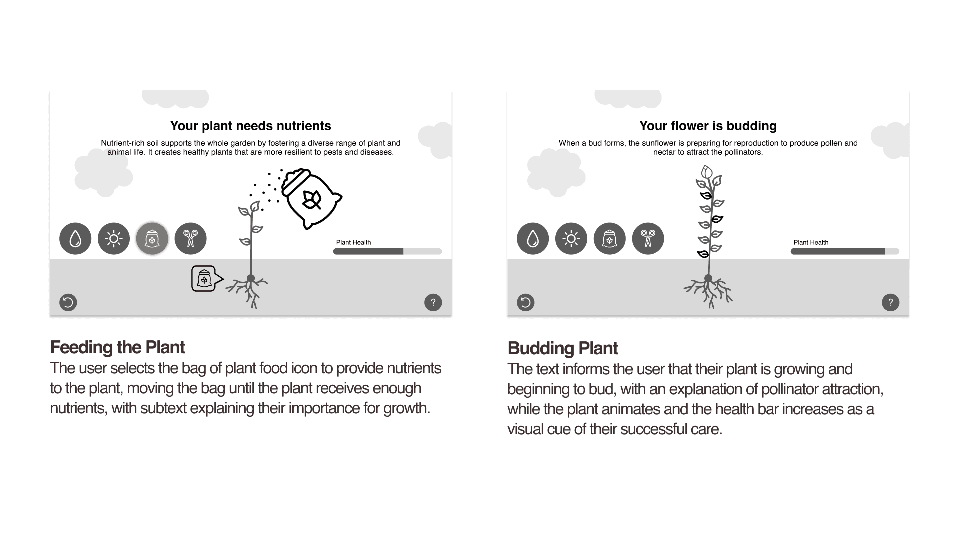
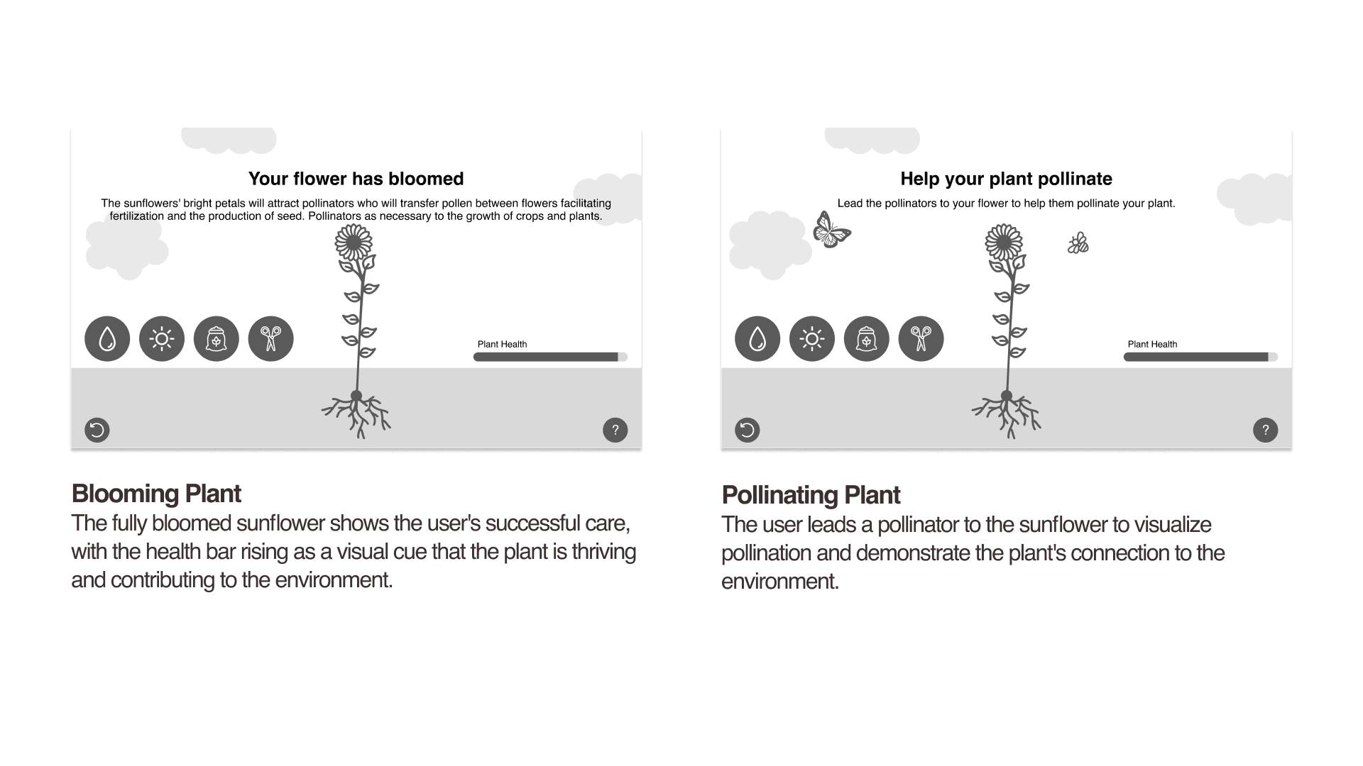
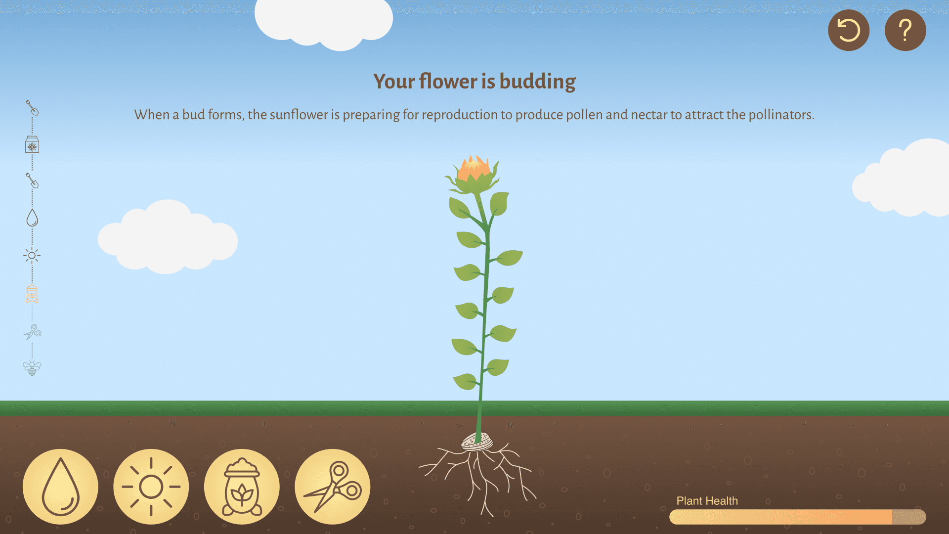
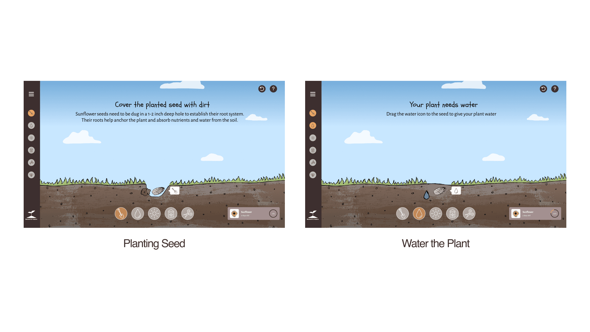
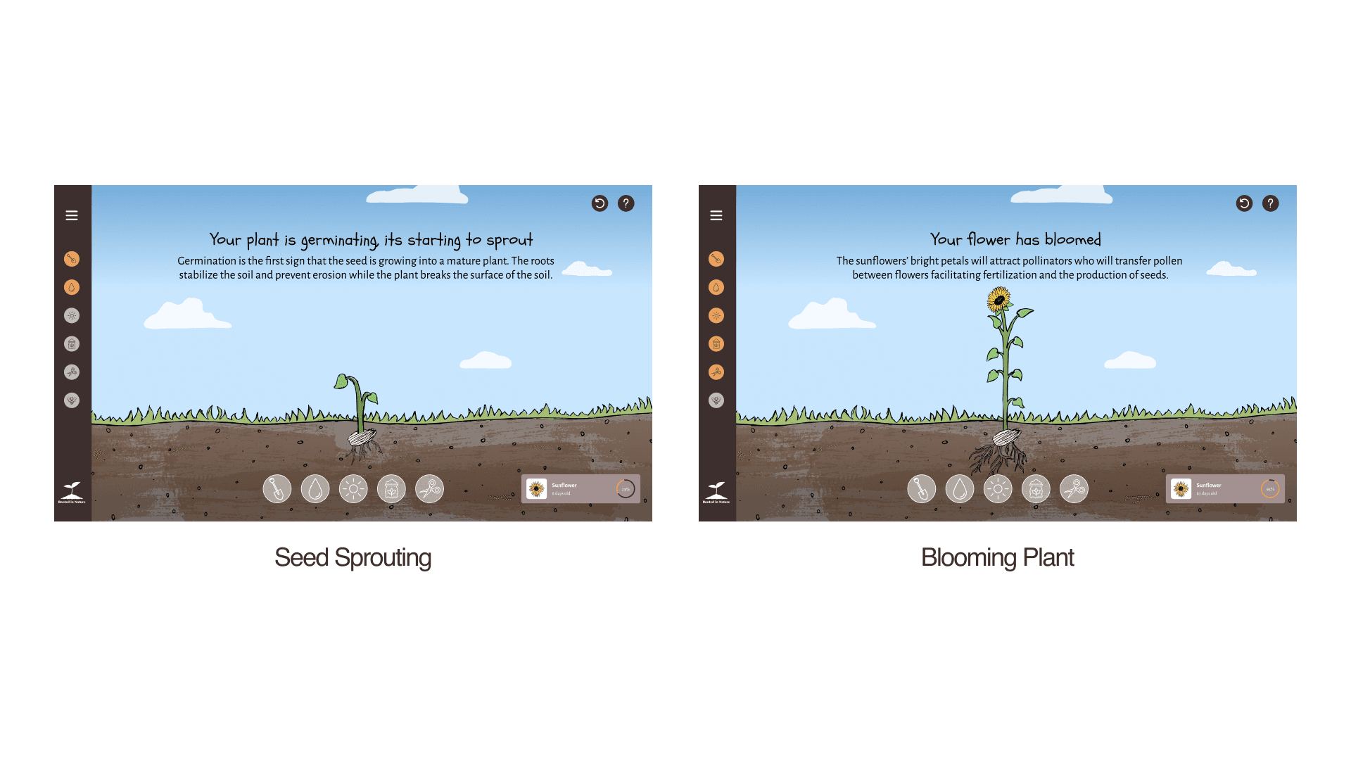
Final Prototype
Problems
1) After the initial interaction in educational experiences, users tend to lose interest and abandon the interactive screen, leading to a lack of sustained engagement.
2) If users don’t receive clear or immediate feedback on the progess of their sunflower’s growth after performing an action, it is difficult for them to track progress.
3) Users are often uncertain about which elements to interact with in educational exhibits resulting in frustration and a poor overall experience.
Solutions
1) To address user disengagement, the experience will include elements such as a step-by-step guided journey for planting and nurturing the sunflower and gamification features, like progress tracking and rewards, to encourage repeated interaction.
2) Clear, visual feedback will be integrated after each user action, such as visual changes in the sunflower's growth to allow users to track their progress and motivate them to continue nurturing their plant.
3) To reduce user confusion, interactive elements will be prominently labeled and visually distinct, guiding users intuitively through each step of the experience.
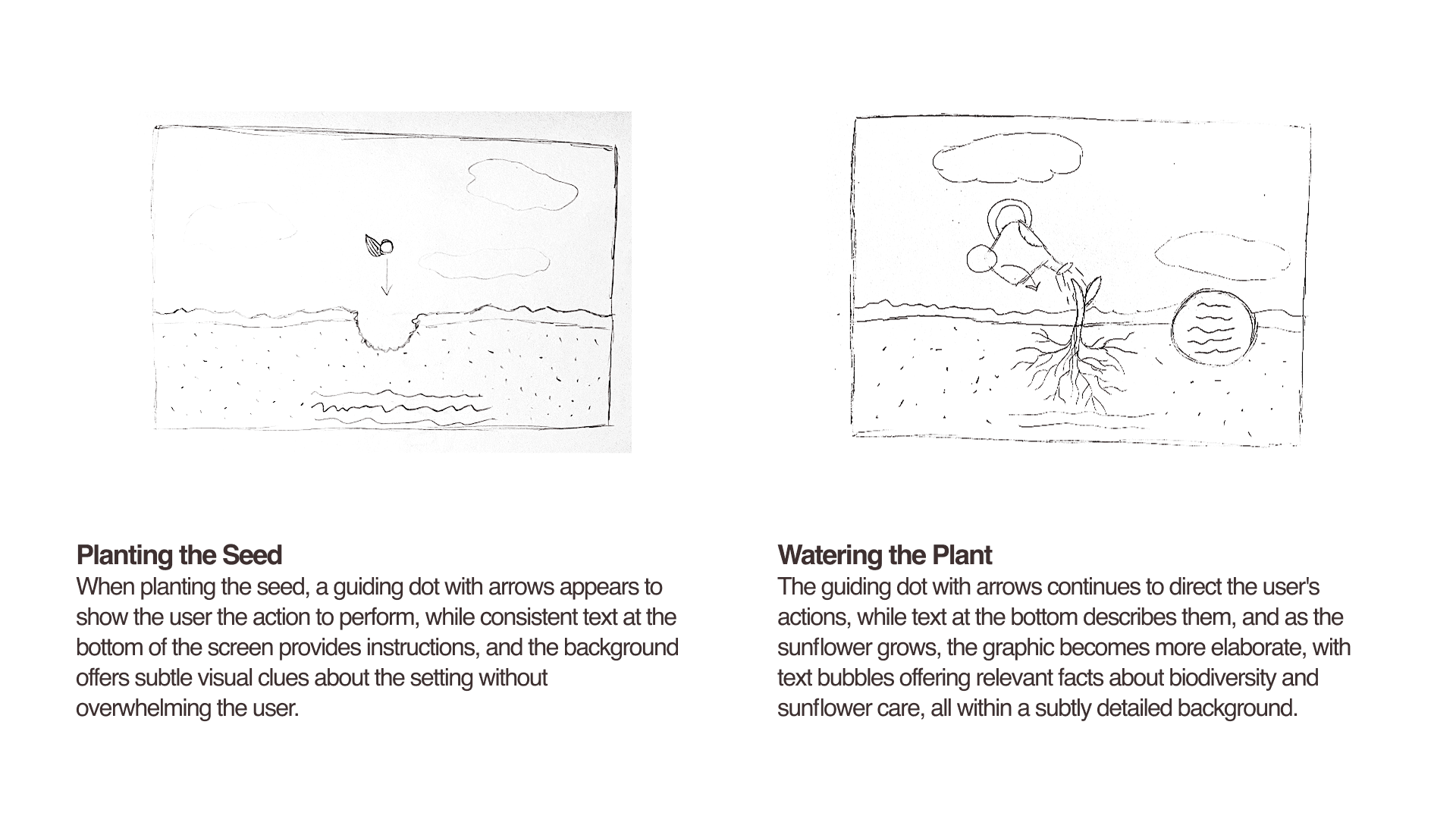
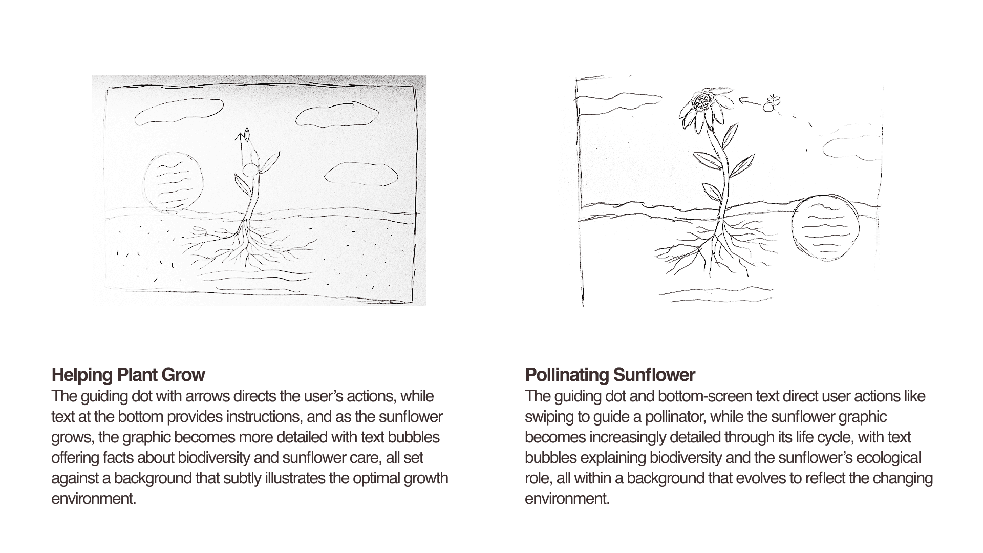
Sketches
Through sketching, I focused on defining key user interactions and designing intuitive pathways that guide users smoothly through each step of the experience.
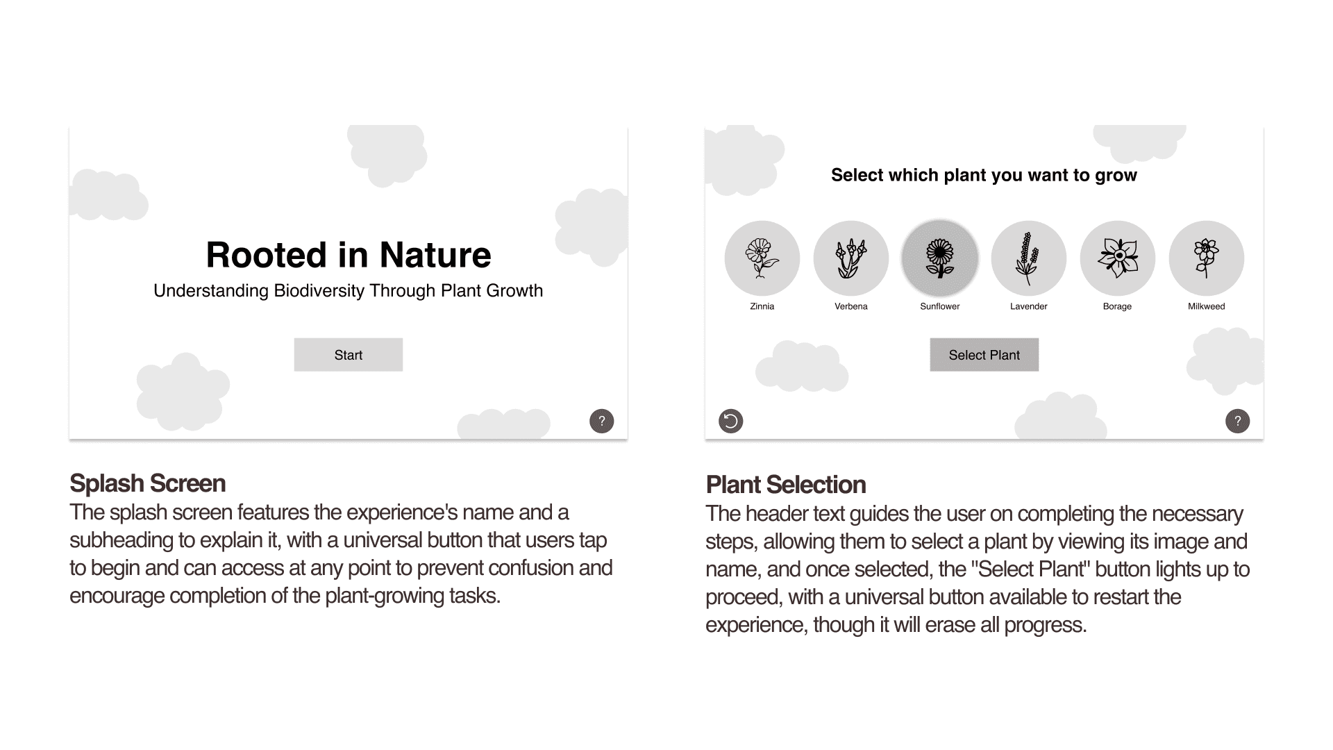
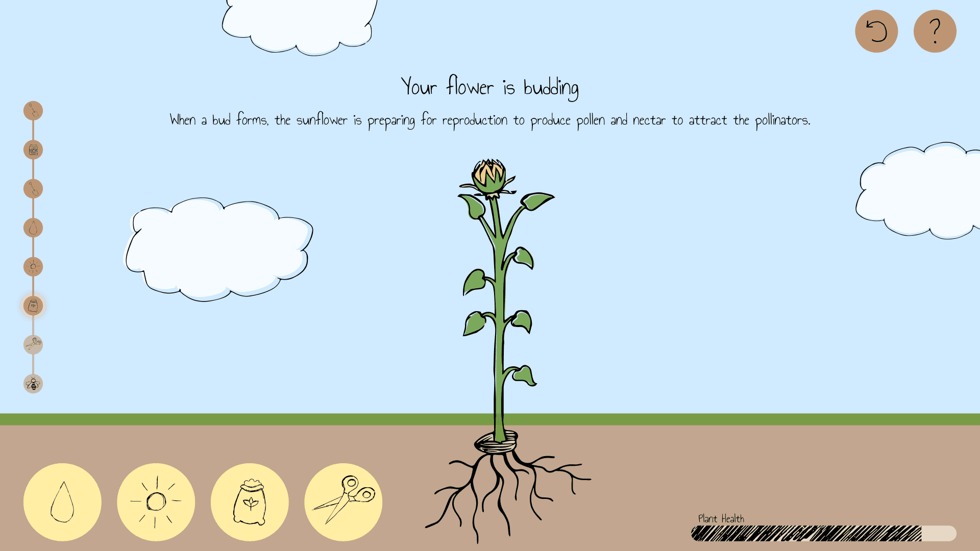
Wireframes
When creating wireframes, I focused on balancing text, graphics, and UI elements to ensure clear hierarchy and logical placement without any one element overpowering another.


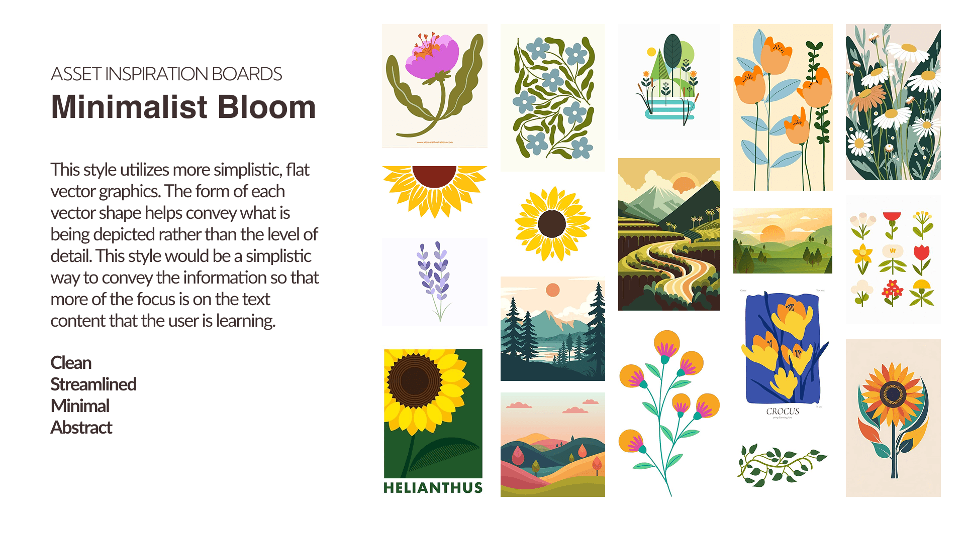
Stylized Compositions
When stylizing my wireframes, I explored three distinct visual styles to encourage ideation and evaluate multiple creative directions.


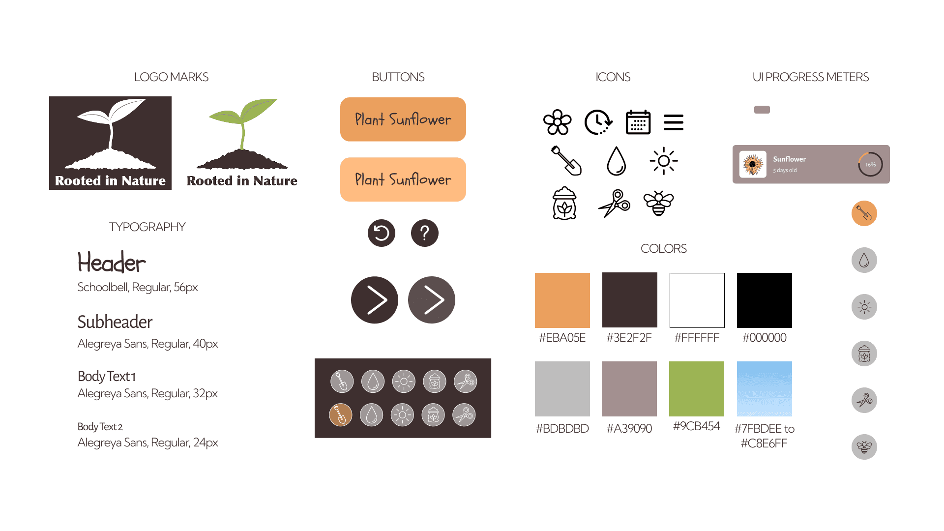
Styleguide
Through iteration, my composition style evolved to best support the project’s visual direction. Once finalized, I created a style guide to centralize and define all design elements.
Final Designs
The final designs synthesize everything I learned throughout the project and reflect an extensive iterative process before reaching the final solution.


Takeaways
Creating Visual Contrast Between UI and Assets
I learned that the UI and visual assets don’t need to share the same style. Trying to match them too closely made the design feel cluttered and unclear. Allowing a bit of contrast helps the interface stand out, making it easier for users to identify what they should interact with.
Intuitive Design Interactions
I learned the importance of intuitive design so users can naturally understand what actions to take at each step. At times, my design lacked clarity, making it difficult for users to complete the intended task.
Establishing UI Structure Before Design Aesthetics
I learned the importance of building a strong UI foundation before concentrating on visual assets. Early on, I focused too much on refining graphics instead of making sure the interface was functional and intuitive, which made later iterations more difficult. Prioritizing structure early streamlines the design process and ensures assets support a cohesive user experience.
