RocRhythm Music App
Project Overview
An interactive app designed to connect users with the music scene in Rochester, NY, highlighting local artists, venues, and hidden cultural gems throughout the city.
Timeline
7 weeks
Software
Figma, Adobe After Effects & Adobe Illustrator
Project Type
Phone Application
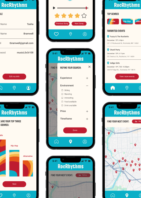
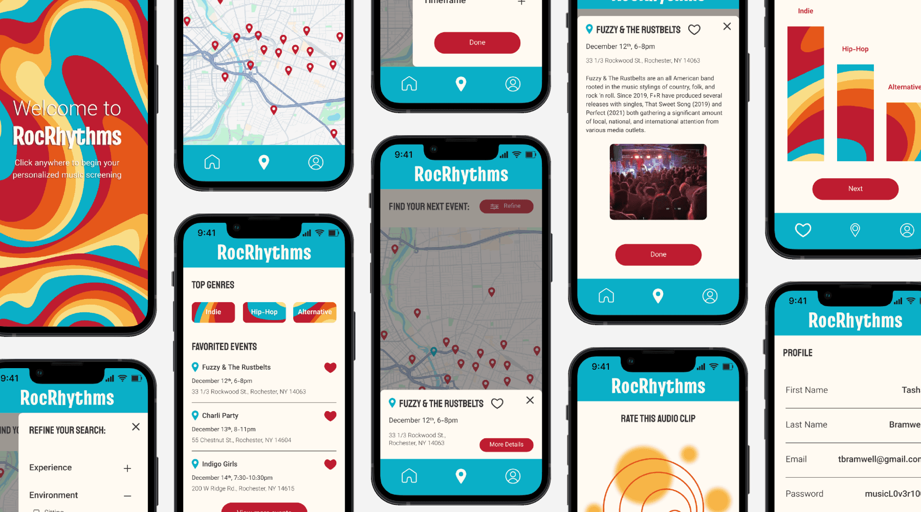
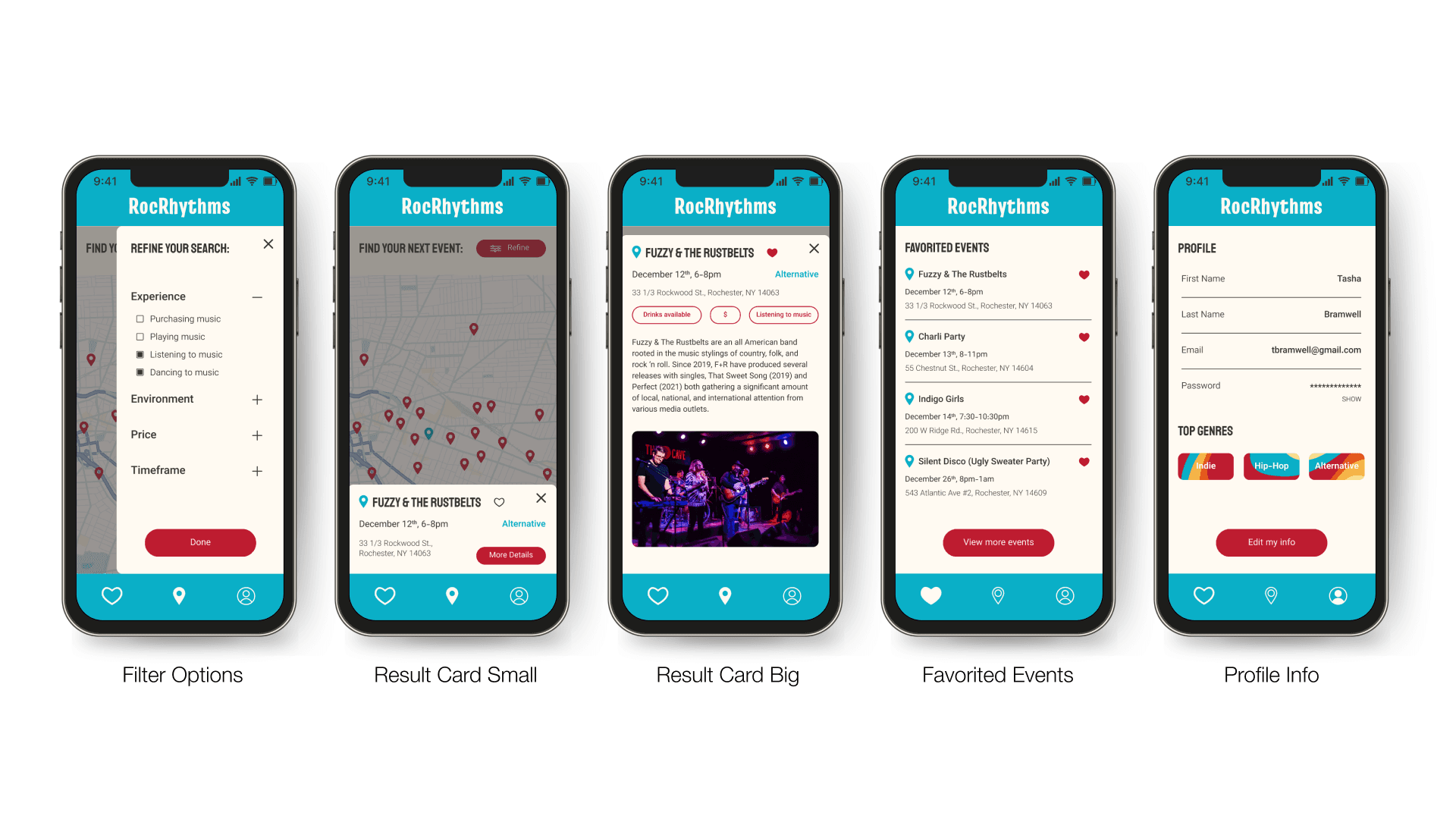
Final Prototype
Problems
1) Users often don’t know about hidden music venues or local artists in Rochester, limiting engagement with the city’s music scene.
2) First-time users may struggle to understand where to go or what to interact with in the app, which can create confusion and reduce engagement.
3) Grouping and presenting all the information about events, artists, and venues can become cluttered, making it difficult for users to digest content effectively.
Solutions
1) RocRhythms highlights local artists and venues through an interactive map and recommendations, making it easier for users to discover and engage with the city’s music culture.
2) The app was designed with clear hierarchy, interactive cues, and simple navigation to ensure users can quickly understand how to explore and engage with content.
3) I iterated on multiple layout options to organize information logically, prioritizing key content and grouping related items together for clarity and ease of use.
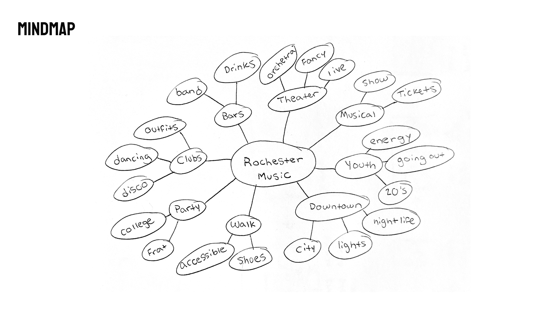
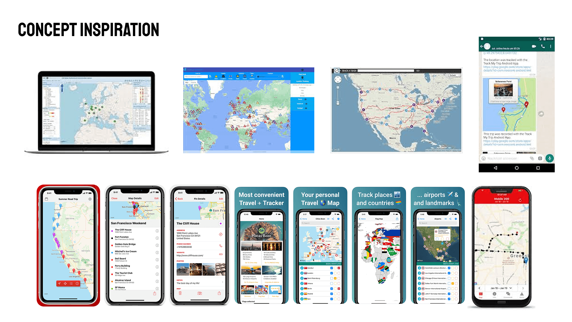
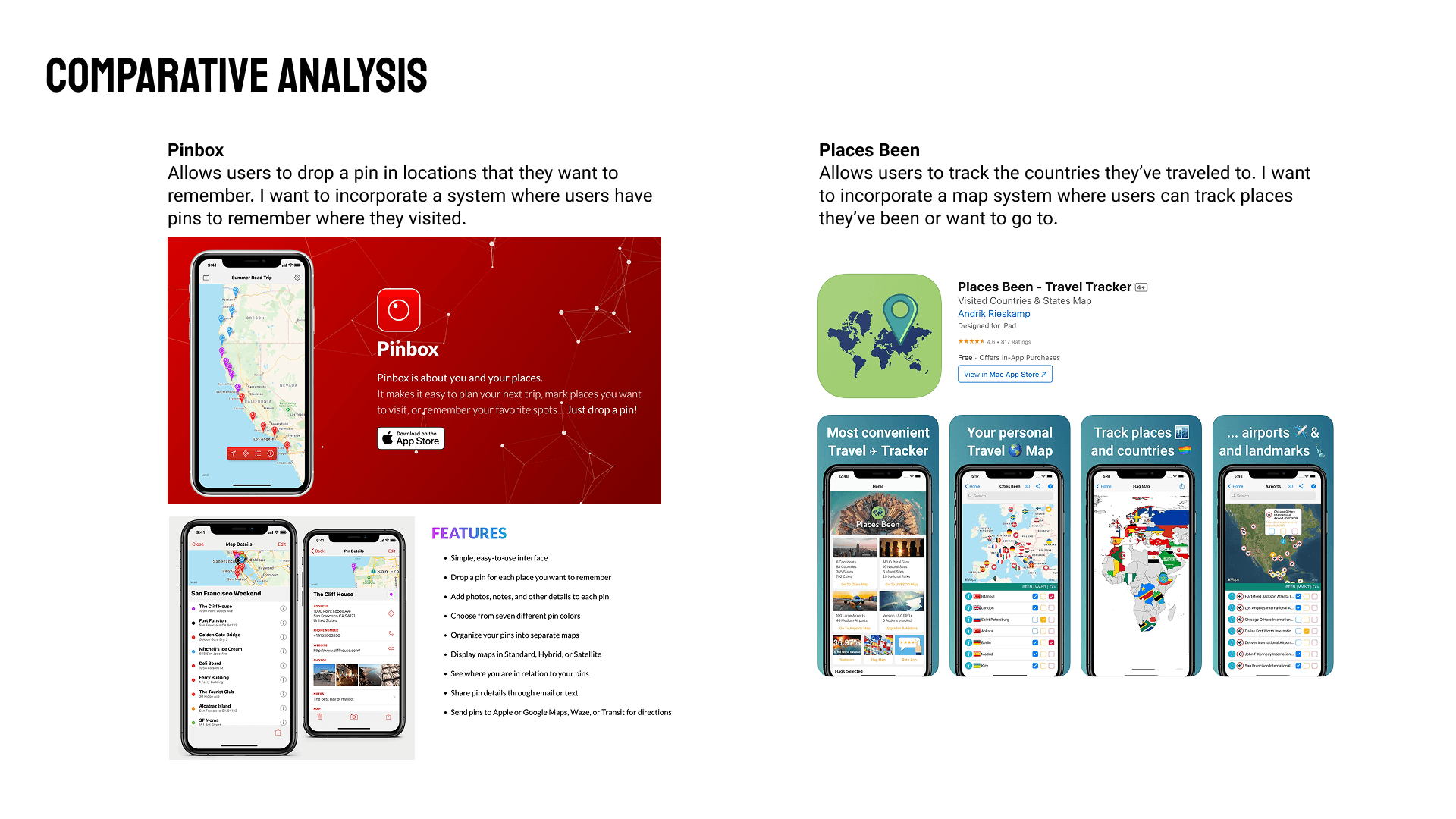
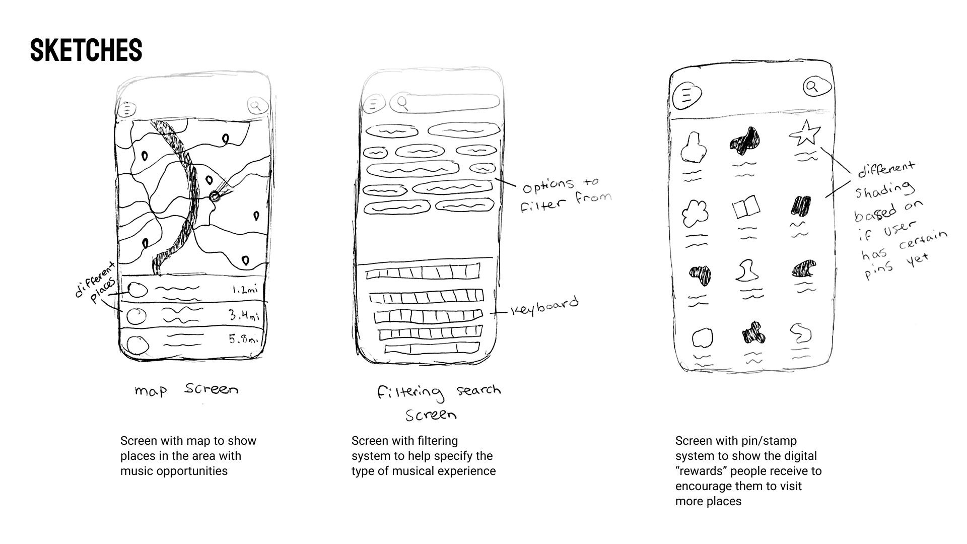
Brainstorming
During sketching, I explored the concept of an interactive map that users could filter to discover events of interest. I drew inspiration from the pin systems used in travel apps, which encourage users to mark locations they want to visit or have already explored.
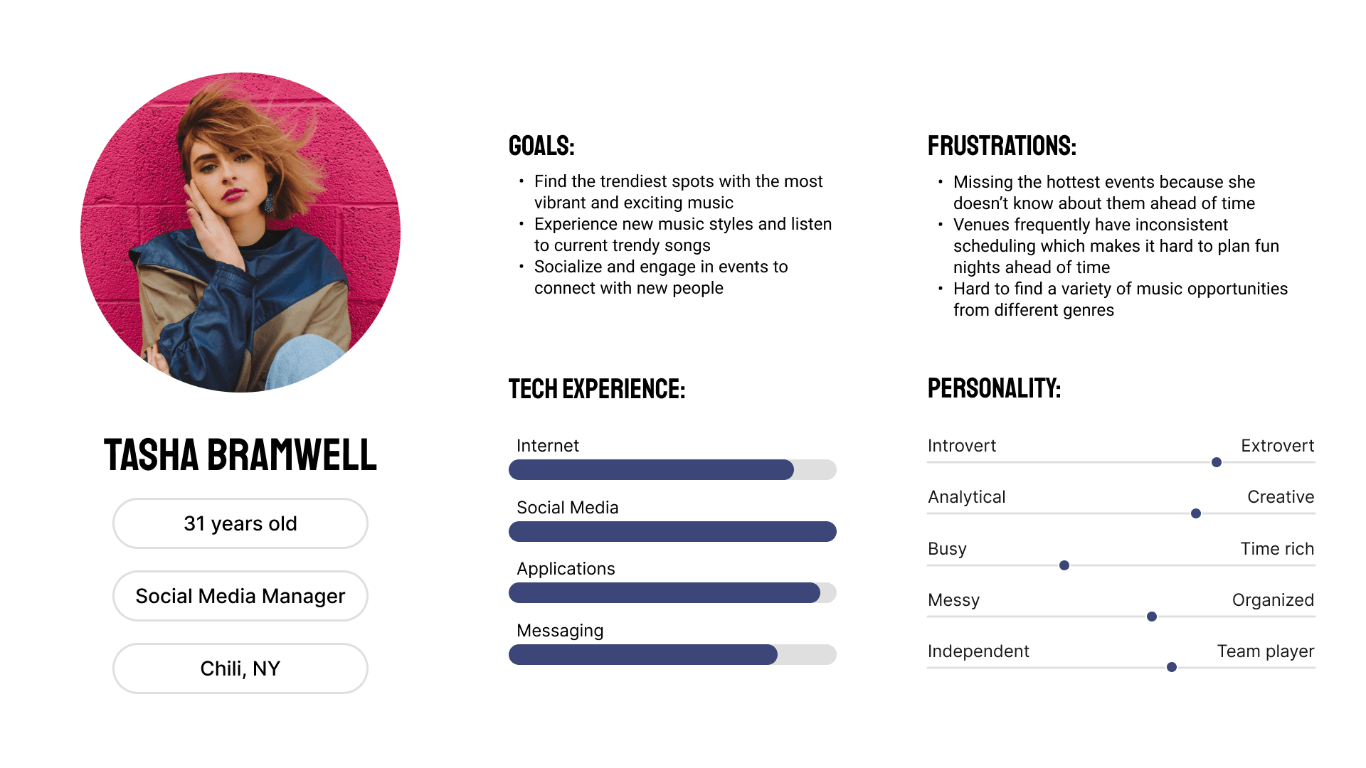
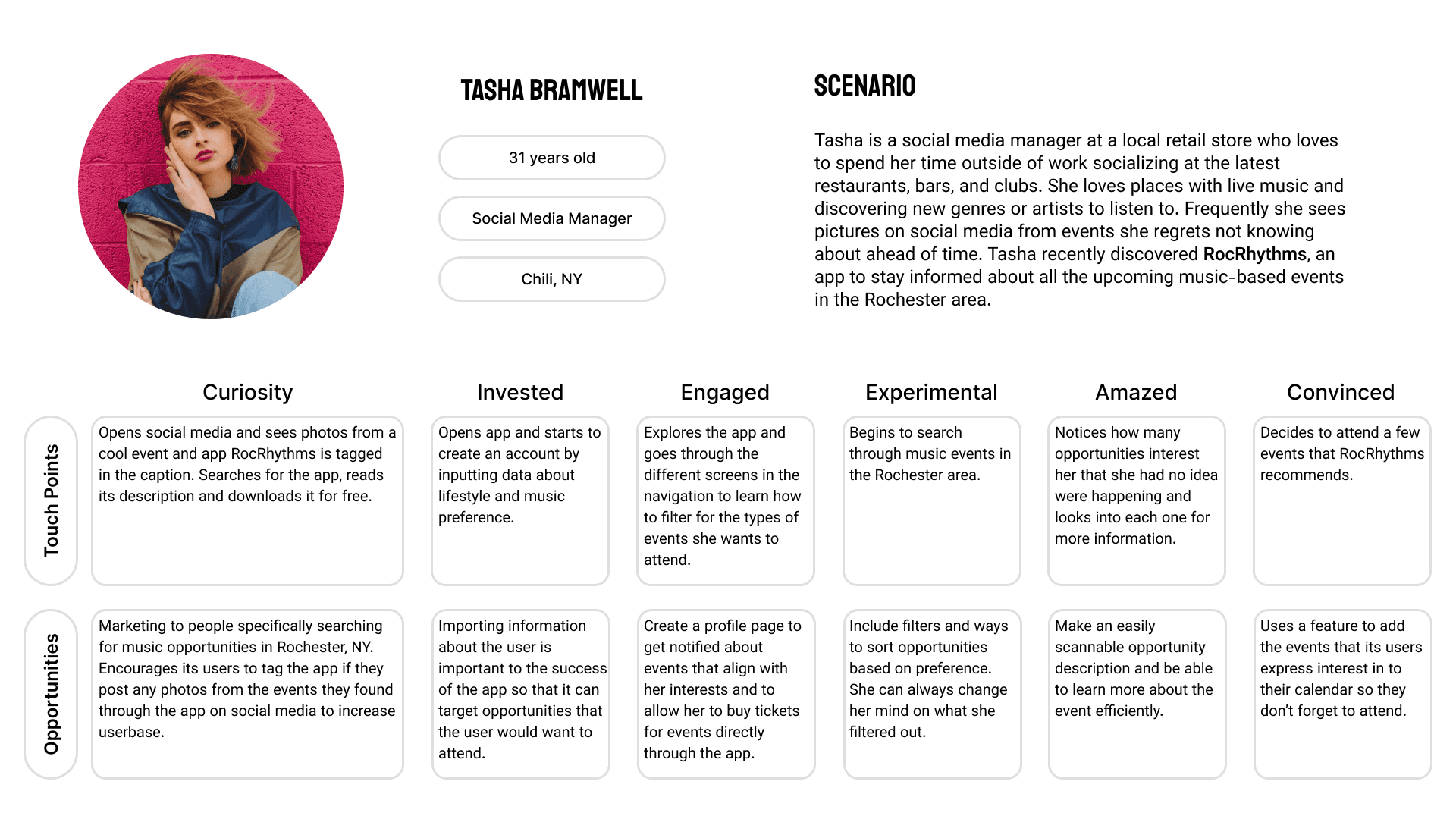
Persona
I developed a persona to better understand the user’s perspective, then mapped a user flow to identify what would motivate her to download and engage with the app.
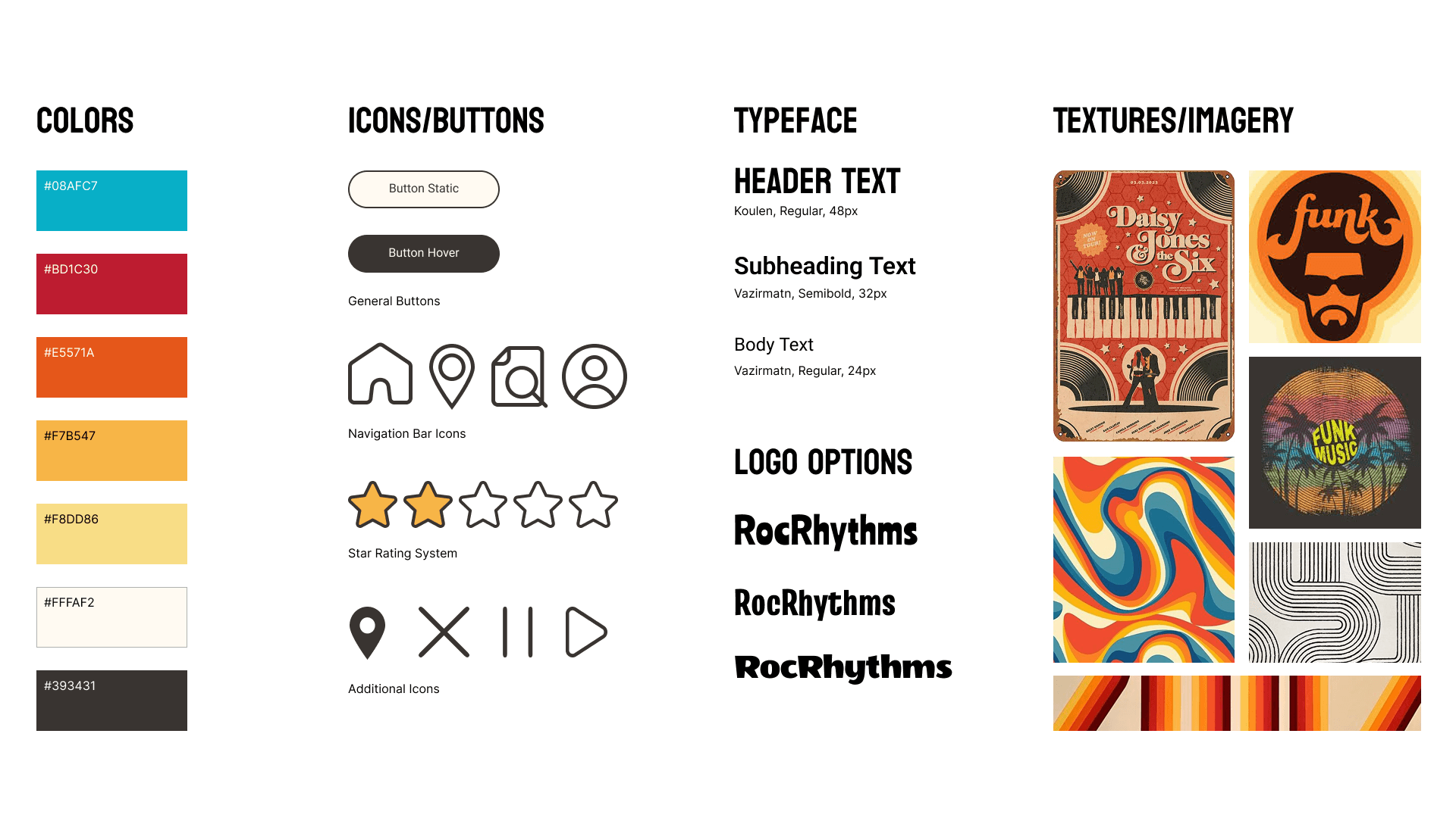
Styleguide
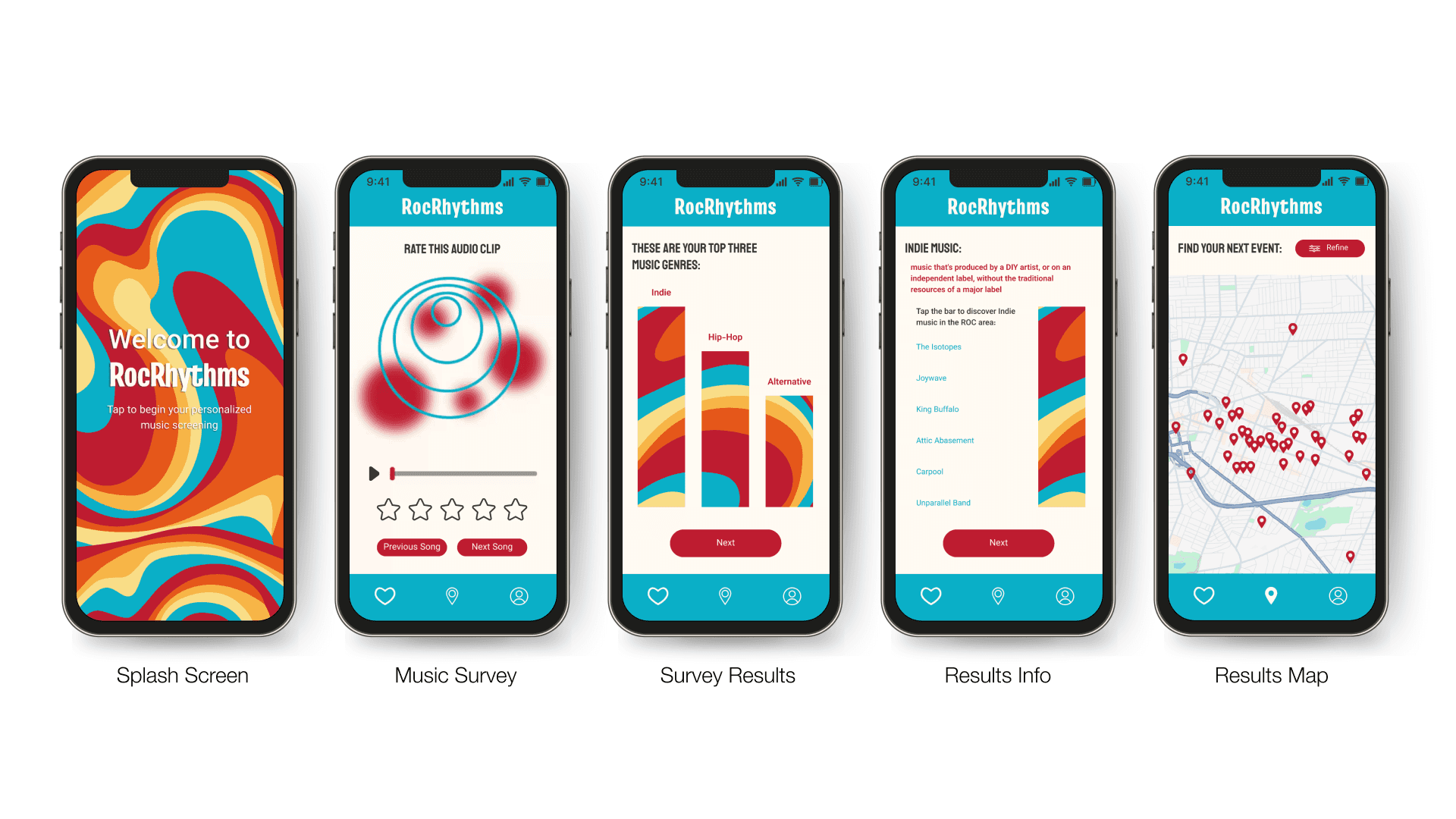
I created a styleboard featuring colors, icons, typefaces, and images to capture the mood of my designs. Drawing inspiration from 1970s and 1980s funk music, I aimed to evoke a vibrant, retro aesthetic throughout the app.
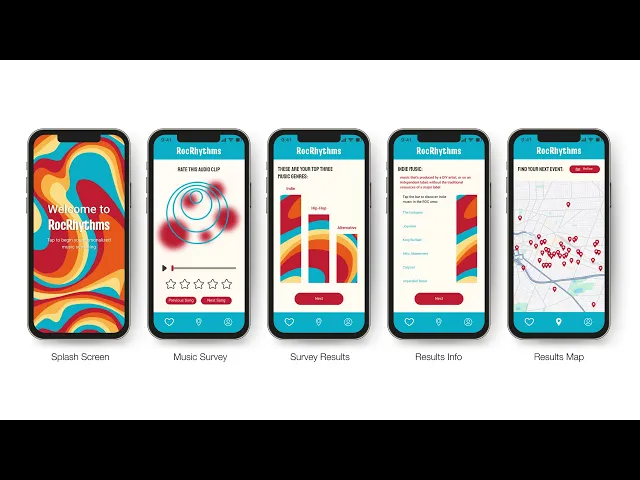
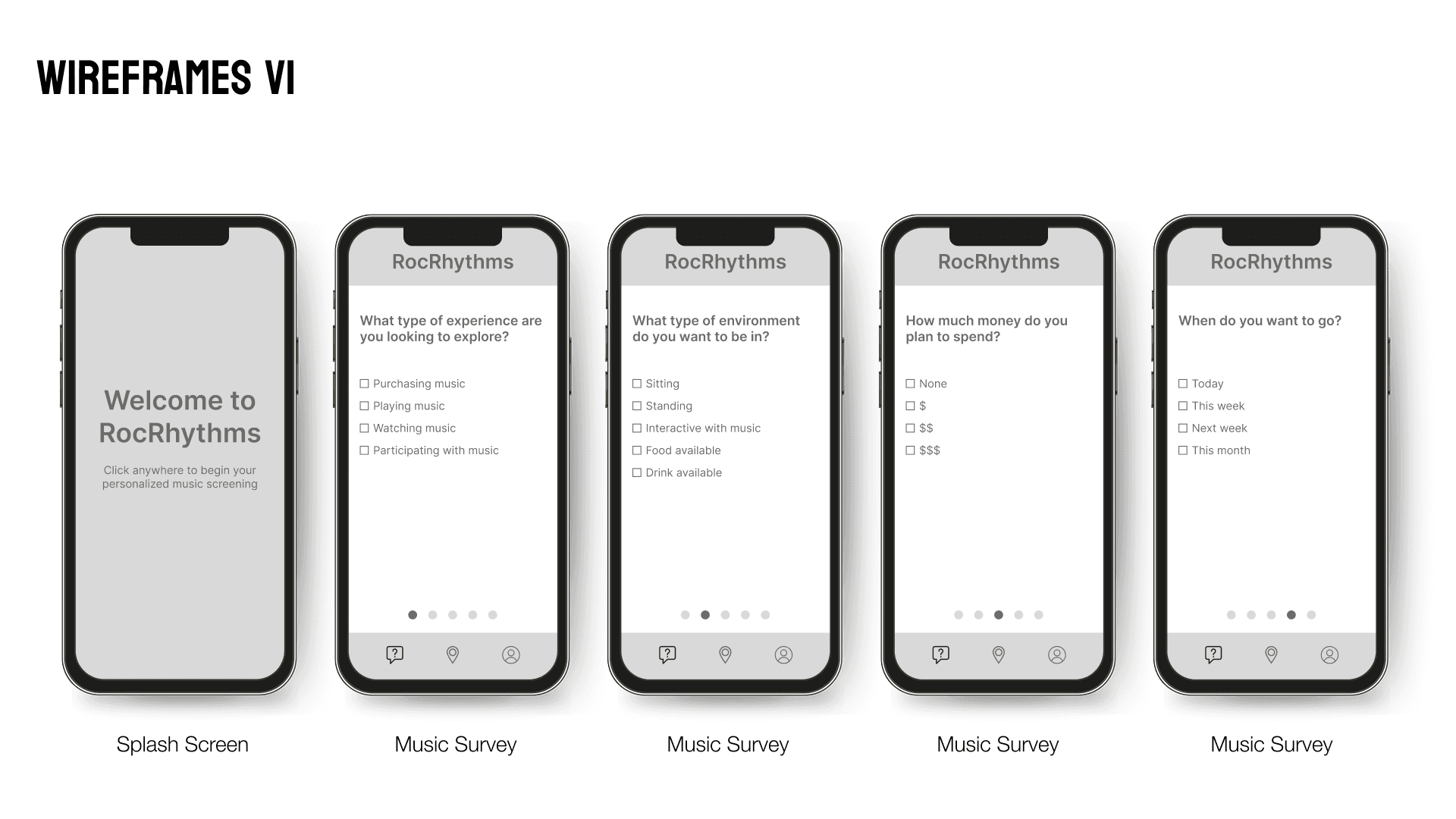
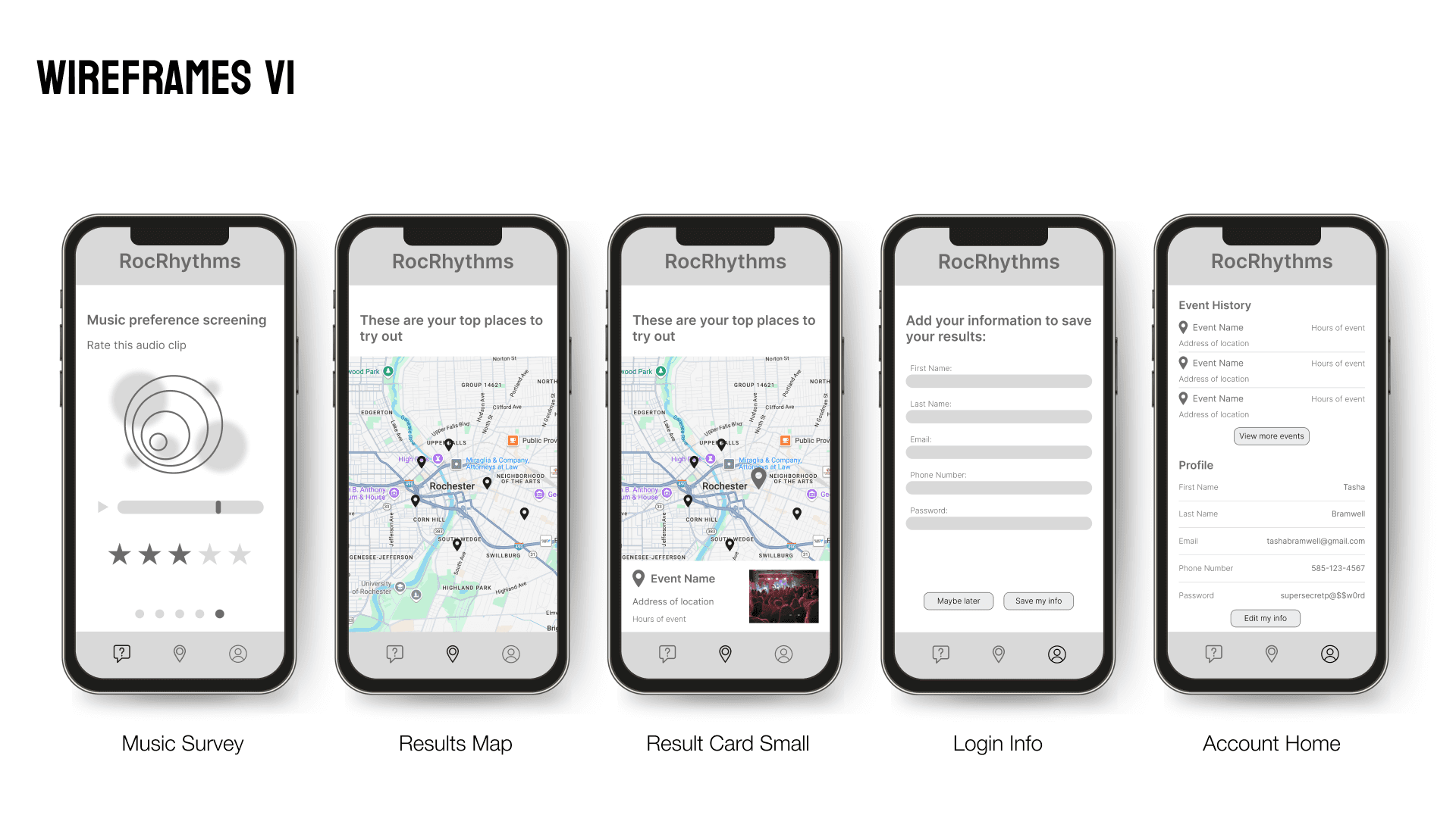
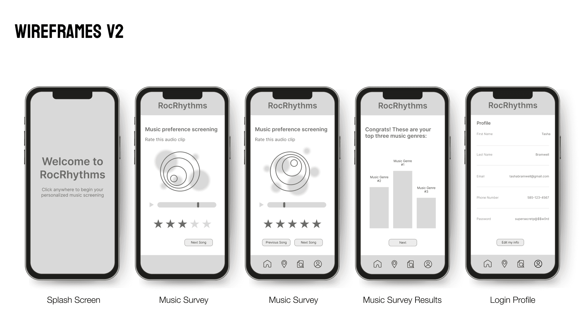
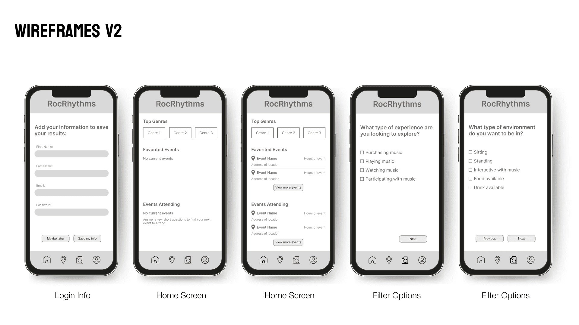
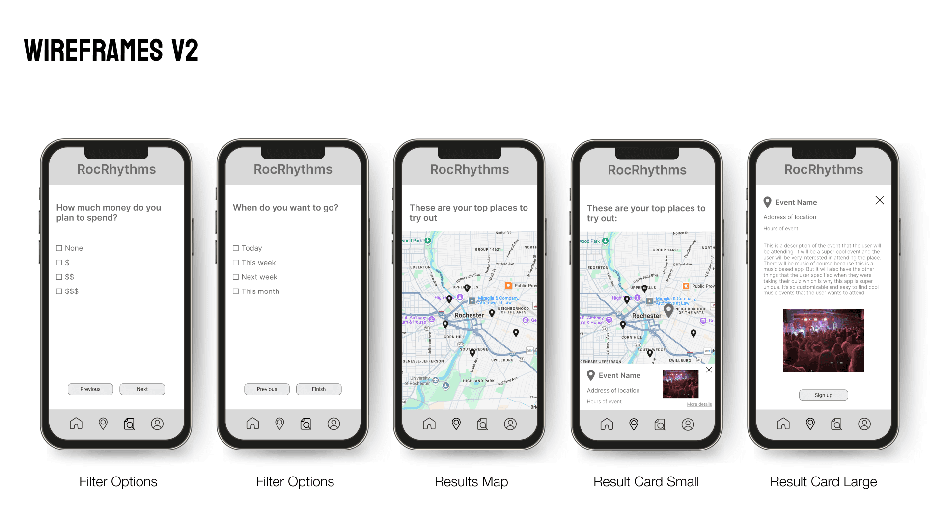
Process Work
I began the design process by creating wireframes to establish the structure of my static frames. Once finalized, I applied visual styling and prototyped in Figma, incorporating custom assets from Adobe Illustrator and animated videos composed in After Effects.
Final Designs
The final RocRhythms designs bring together intuitive navigation, clear information hierarchy, and visually engaging elements to create a seamless user experience. Every decision reflects a balance between promoting Rochester’s music scene and ensuring users can easily discover and interact with local artists and venues.


Takeaways
Intuitive Onboarding is Essential
Designing RocRhythm reinforced the importance of intuitive interfaces, especially for first-time users. Clear hierarchy and obvious interaction points help users understand where to go and what to do without friction.
Information Layout Comes First
This project highlighted how critical early decisions about layout and information grouping are to the overall success of an interface. Spending more time upfront on structure would have reduced the need for extensive redesign later.
Prioritizing Foundation Over Features
I learned the value of establishing a strong foundational layout before introducing unique or advanced features. A well-organized interface makes additional functionality feel more natural and easier to integrate.