
Digital Driver's License App
Project Overview
A smartphone-based digital driver’s license UI with application of visual design principles to optimize communication, layout, and interaction for mobile use.
Timeline
8 weeks
Software
Figma, Adobe Illustrator & Adobe Photoshop
Project Type
Phone Application
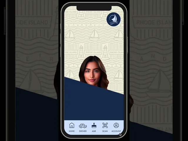
Final Prototype
Problems
1) Physical IDs are static and cannot evolve with the user over time. Because licenses are meant to last for years, the information must remain fixed and often becomes outdated or inflexible.
2) The limited size of physical IDs restricts how much information can be displayed. This constraint forces poor content grouping in order to fit all required text.
3) While digital licenses aim to address physical ID limitations, existing solutions lack state-specific identity. As a result, they feel generic, monotonous, and disconnected from users.
Solutions
1) I designed a digital wallet app capable of housing multiple IDs in one centralized location. This allows users to easily access all of their licenses from a single interface.
2) By restructuring the layout of the license to group related information together for improved scannability. This approach also enables users to selectively display only the information needed in specific situations.
3) The visual design is rooted in the identity of a specific state to foster familiarity and connection. By resonating with residents, the app becomes more engaging and more likely to be adopted.
Sketching
Through sketching, I focused on restructuring information to prioritize user needs and ease of use. Exploring multiple layout options helped identify the most effective organization and hierarchy.


Wireframing
Wireframing allowed me to test layout, hierarchy, and interaction patterns in a low-fidelity environment. Establishing a strong structural foundation before visual design helped prevent usability issues later in the process.


Styleguide
After wireframing, creating a style guide was essential to establish visual consistency and ensure design decisions aligned with the app’s structure and functionality. The style guide was inspired by the state of Rhode Island, incorporating local motifs and visual references to foster state pride and create a stronger connection with residents.

Process Work
I explored several styling iterations to test how visual choices impacted layout, hierarchy, and readability. Iterating on these designs helped identify the most effective balance between aesthetics and usability.


Final Designs
The final designs bring together everything learned during this process, combining thoughtful information hierarchy, iterative testing, and community-focused visual design. The result is a cohesive solution grounded in both user needs and context.


Takeaways
Iteration Strengthens Design
Iterating through multiple design versions creates more opportunities for exploration and improvement. Although redesigning can be time-consuming, each iteration results in a stronger and more refined outcome.
Intuitive Design Matters
An effective design should feel intuitive, allowing users to interact with the information without needing to think about how the interface works. Reducing friction helps users stay focused on the content rather than the mechanics.
Low-Fidelity Wireframing is Essential
Creating wireframes without visual styling helps validate whether a concept truly solves the problem. Focusing on structure and hierarchy before aesthetics leads to more intentional and effective design decisions.
