Clockwork Nail Art Kiosk
Project Overview
A robot nail art kiosk that lets users order and receive nail art from their seats, delivering a fast, seamless, and fully digital experience that elevates the brand, Clockwork and reimagines on-the-go beauty.
Timeline
11 weeks
Software
Figma, Adobe Illustrator & Adobe Photoshop
Project Type
Kiosk Checkout Application
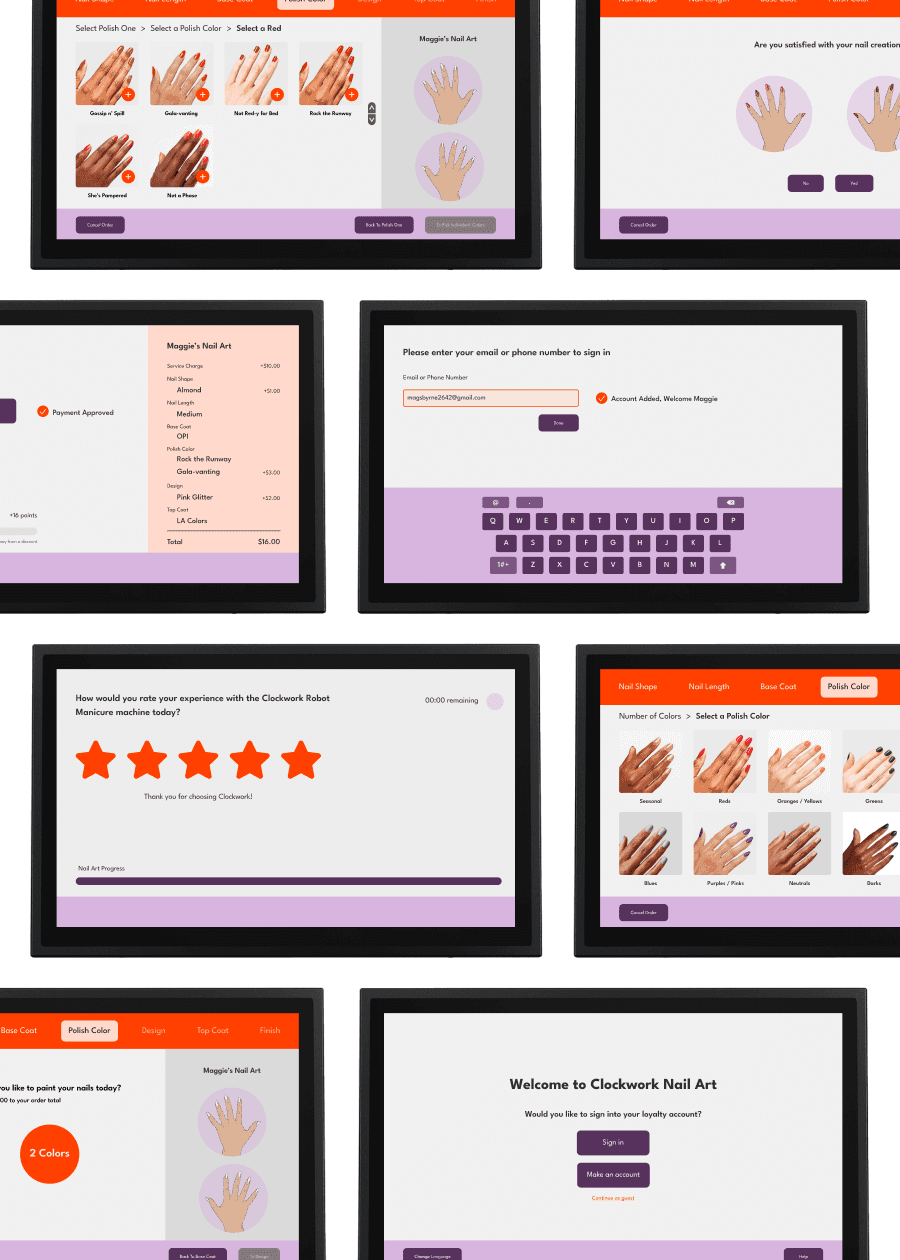
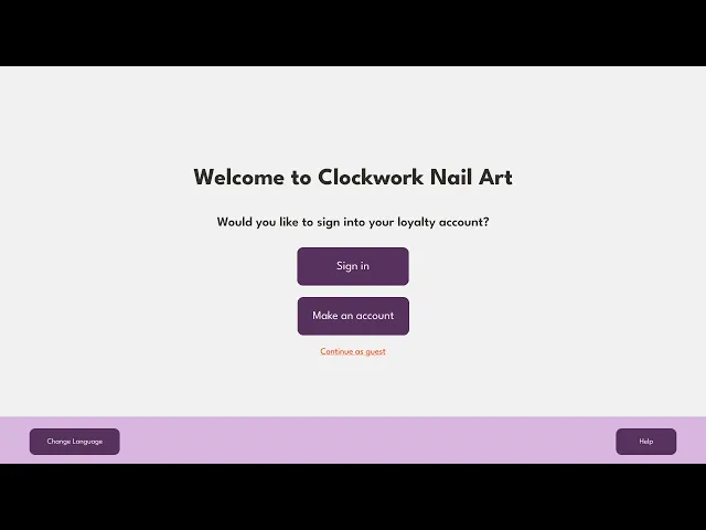
Final Prototype
Problems
1) The robotic nail service, Clockwork, requires additional staff involvement or unclear handoffs, preventing users from independently completing the full ordering process. This fragmentation limits efficiency and weakens the overall user experience.
2) Without a fully digital interface, the robotic system is confined to traditional salon environments and requires specific spatial or staffing conditions. This limitation restricts the brand’s ability to scale or adapt to new contexts.
3) Interacting with a robotic nail system can feel unfamiliar or intimidating, especially for first-time users without clear guidance. Poorly structured flows increase cognitive load and can reduce trust in the system.
Solutions
1) I designed a kiosk interface that allows users to complete the entire ordering process from their seat, reinforcing the value of intuitive, end-to-end digital experiences.
2) By creating a kiosk-based experience, I expanded how and where the service could be used, demonstrating how digital systems can increase accessibility and brand reach.
3) I focused on simplifying the flow with clear hierarchy and step-by-step interactions, reinforcing the importance of designing intuitive interfaces that require minimal instruction.
UX Focused
Design Process
UX design was central to this project, as it challenged me to think beyond visual design and focus on research, workflow mapping, wireframing, and iteration to create an intuitive, self-guided kiosk experience. Through this process, I learned how thoughtful UX decisions directly shape usability, efficiency, and user confidence when interacting with emerging technologies like robotic services.
Planning
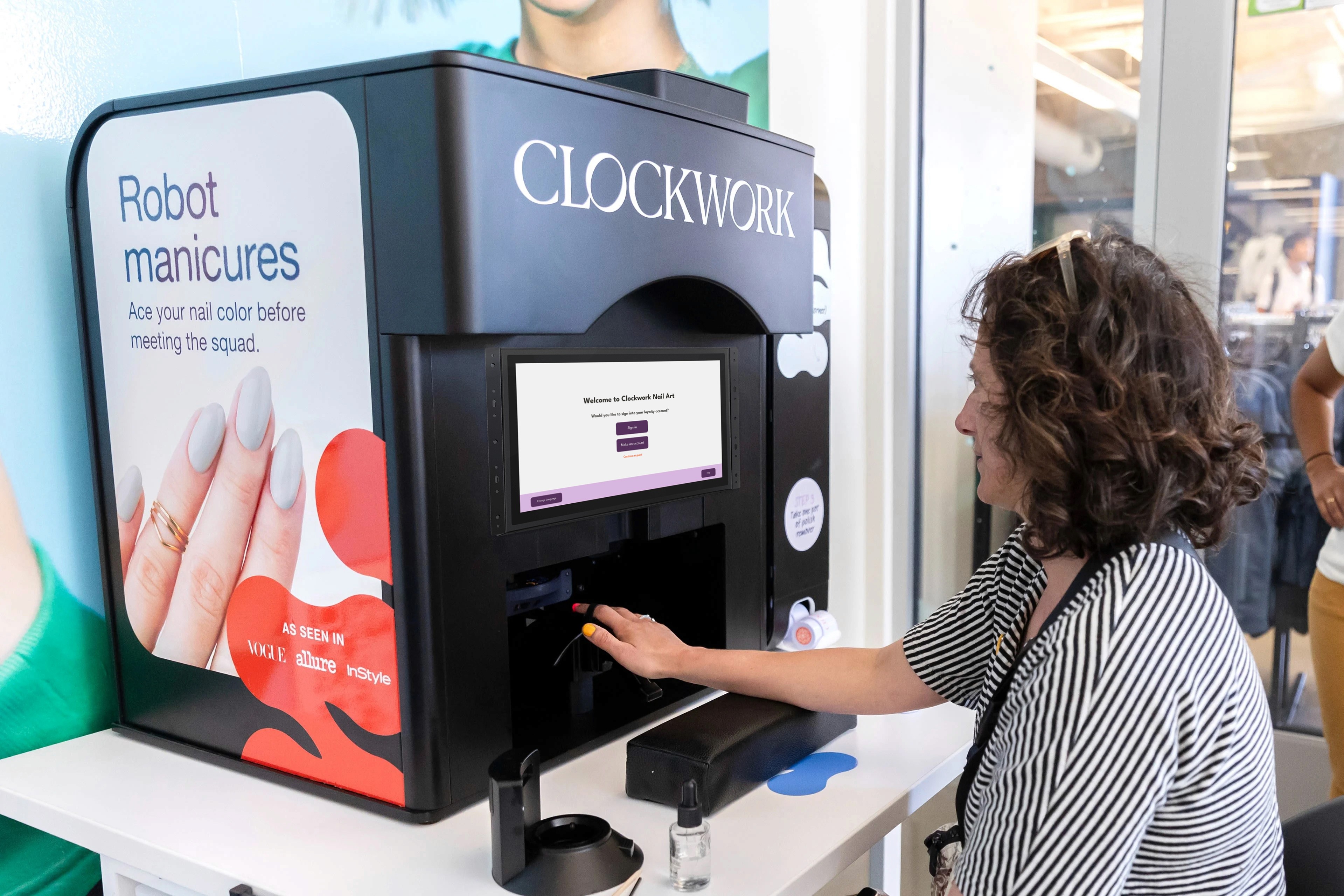
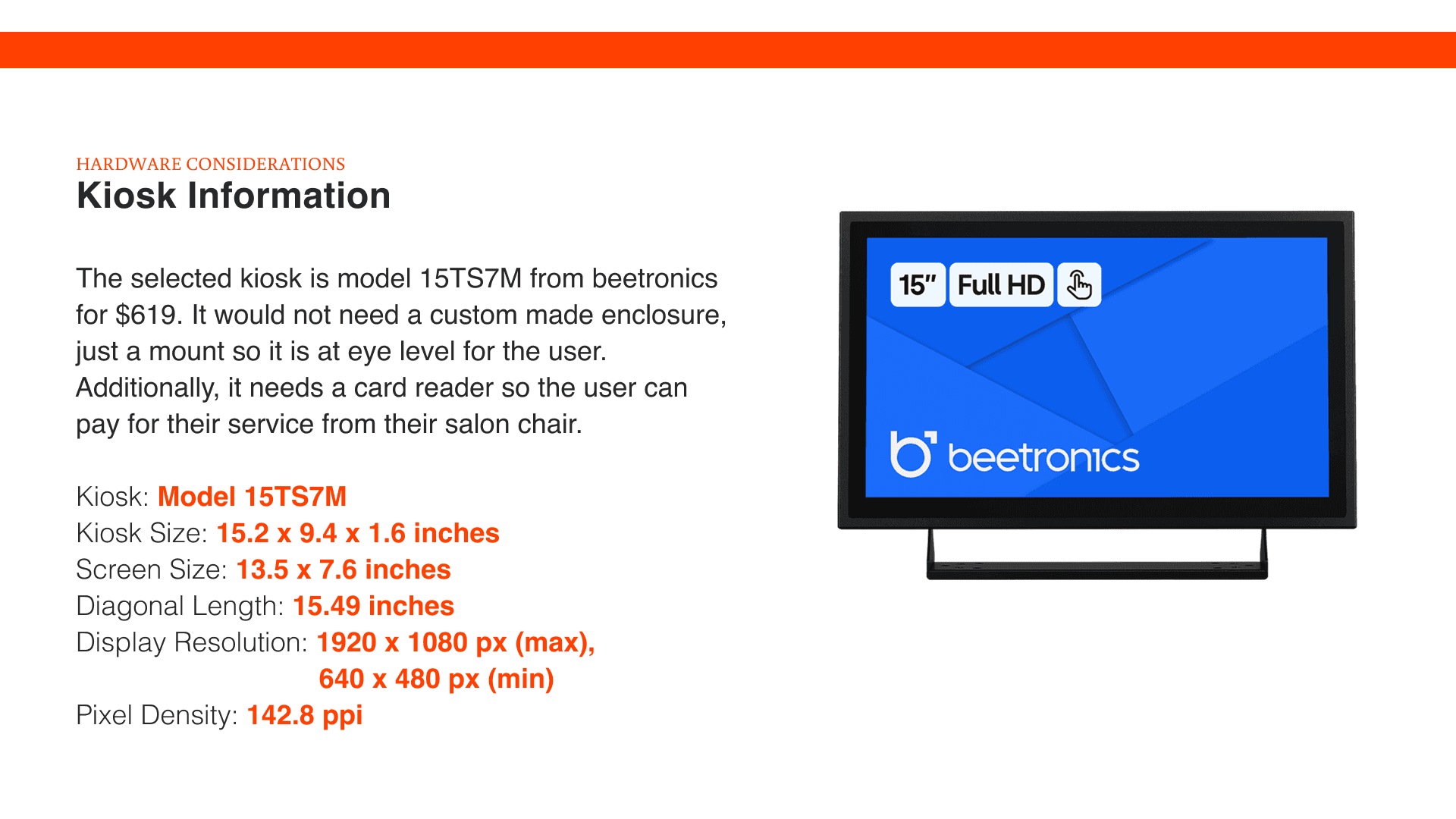
During planning, I researched the target audience and intended users to better understand their needs and expectations. I also examined the kiosk’s physical context including location, placement, and screen height to ensure the interface was designed for real-world use.


Mockups
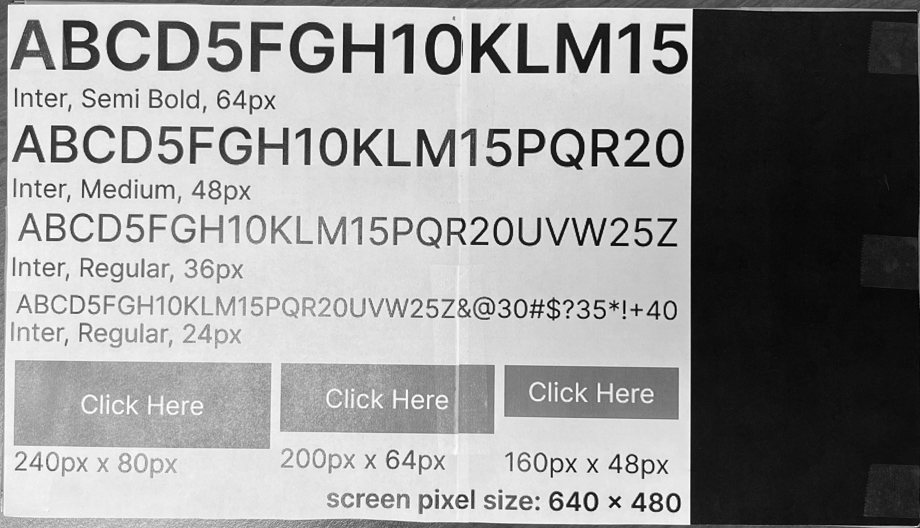
For mockups, I designed key interface elements and printed them at full scale to evaluate how they would appear and function on the kiosk screen. This process helped determine appropriate element sizing, touch targets, and the screen resolution best suited for user interaction.


Workflow Diagram
The workflow diagram outlines all primary and alternative user paths, helping anticipate user decisions and reduce friction throughout the kiosk experience.

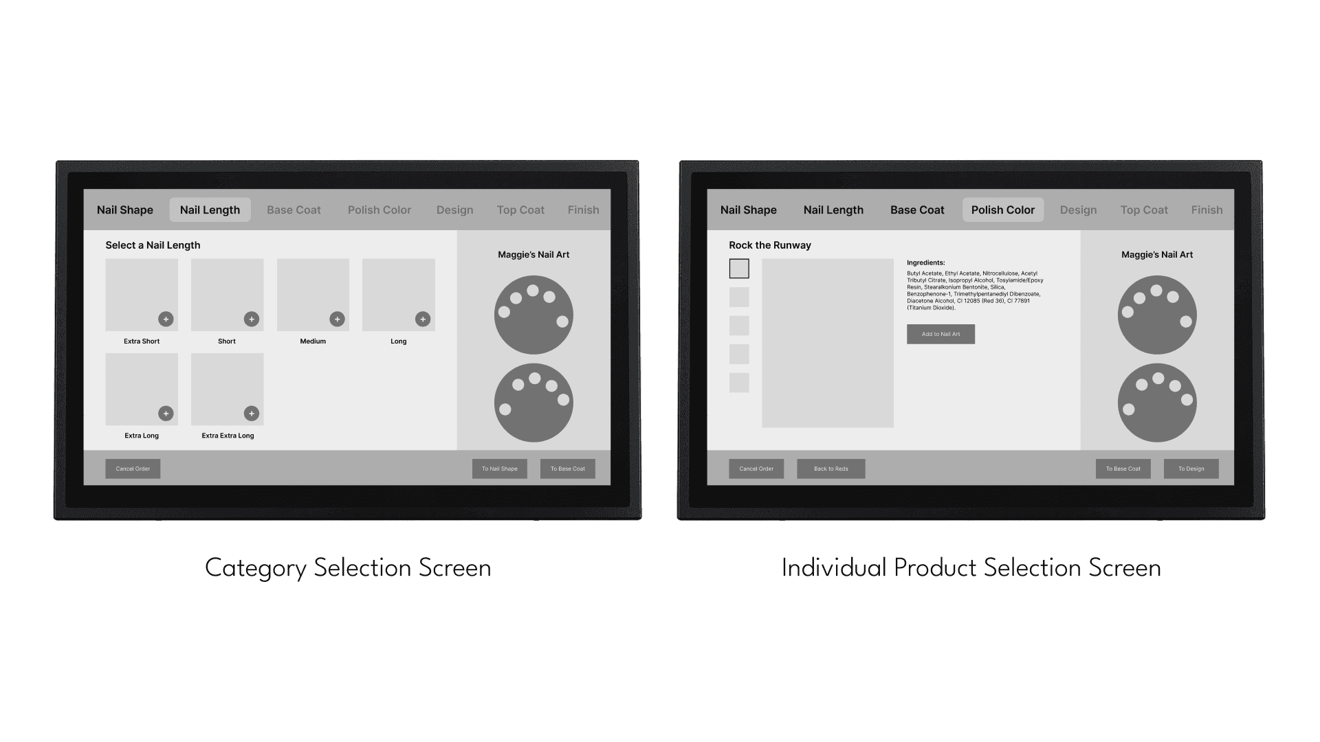
Wireframes & Styling
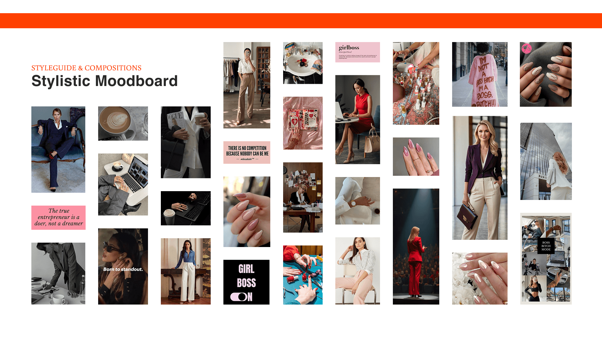
For wireframes and styling, I drew inspiration from Clockwork’s existing branding and the target audience through a curated moodboard. I also applied insights from the full-scale mockups to define spacing, proportions, and hierarchy, ensuring the layout was optimized for real-world kiosk interaction.


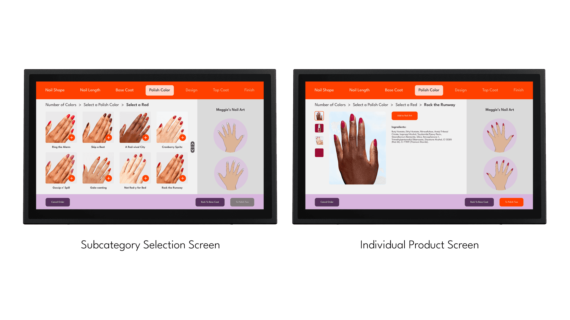
Final Designs
The final designs refresh Clockwork’s visual identity while maintaining the integrity of the original brand, resulting in a cohesive and modern kiosk experience allowing users to independently navigate the ordering process.


Takeaways
UX Foundations Drive Successful Interaction
This project reinforced the importance of grounding design decisions in research, requirements, and workflow mapping before moving into visual design. Establishing a strong UX foundation led to a more intuitive and reliable kiosk experience.
Designing for Self-Guided Experiences Requires Clarity
Creating a fully self-service kiosk highlighted the need for clear hierarchy, guidance, and error handling. I learned how reducing cognitive load is essential when users must navigate an experience independently.
Iteration Strengthens Complex Systems
Working through multiple iterations across wireframes, layouts, and interactions demonstrated how refining structure over time improves usability and confidence in the final design. Iteration became a critical tool for solving complexity in large, end-to-end experiences.