
Aether Airline Booking Site
Project Overview
A user-centered redesign of the multi-city flight booking experience, balancing complex travel choices with usability, feedback, and error prevention.
Timeline
12 weeks
Software
Figma & Adobe Illustrator
Project Type
Website & Design System
Final Prototype
Problems
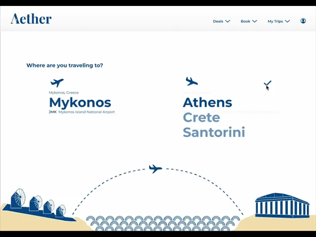
1) Users feel overwhelmed by the complexity of planning a multi-city trip that requires them to juggle dates, destinations, flight options, and add-ons.
2) Users often become frustrated when fees, baggage options, or flight selections are unclear, leading to unexpected costs and mistrust.
3) Booking errors and invalid inputs cause frustration and can interrupt the flow, forcing users to backtrack and increasing the likelihood of abandonment.
Solutions
1) A step-by-step, organized booking flow guides users through date selection, city selection, and flight choices, reducing complexity while maintaining flexibility.
2) Flight options, add-ons like checked baggage, and a continuously updated total cost are clearly displayed, with visual confirmation of selections at each step.
3) Constraints, real-time validation, and a final confirmation screen prevent common errors and help users complete bookings with confidence.
Aura DS
To support consistency and scalability across Aether Airline’s digital products, I created a design system grounded in the brand’s visual identity and UX foundations. After analyzing the interface’s UI needs, the system was designed to bring clarity, efficiency, and cohesion to the product experience.
The system includes a structured library of reusable components, organized assets, and clear usage guidelines to support future expansion. Built as a well-organized Figma file, it prioritizes consistency, usability, and ease of collaboration. It serves as a flexible framework for extending Aether Airline’s digital ecosystem rather than a prescriptive recreation guide.

Design Tokens
Design tokens are the foundational building blocks of the design system, defining the shared visual and functional values used across the interface. In Aura, tokens standardize key properties such as brand colors, typography scales, spacing, and grid guidelines into a single source of truth.
By abstracting these values into tokens, the system ensures visual consistency, supports efficient design iteration, and streamlines developer handoff. Tokens help uphold brand guidelines while making the interface easier to maintain and scale across current and future products.

Figma Variables
Figma variables were used to implement the Aura design tokens in a way that supports clarity, flexibility, and consistency throughout the design process. By defining variables for values related to interactivity, error states, and content hierarchy, the system creates a shared language across components and screens.
Using variables enables faster updates, clearer communication between designers and developers, and more efficient iteration as the product evolves. This approach helps maintain consistent behaviors and visual hierarchy while supporting scalable design changes across the system.

Components
Figma components were used to translate design tokens and variables into reusable interface elements. By building components for common UI patterns, such as navigation elements, form inputs, and cards, the system ensures consistency across the interface while reducing repetitive design work.
Components make it easier to scale the product, apply updates efficiently, and maintain alignment with the design system. Through shared structures, variants, and interaction states, they support faster iteration and smoother collaboration between designers and developers.

Planning
To ensure airports had non-conflicting flights to and from each destination, boarding, departure, and arrival times were predetermined based on the travel duration for each route.


Process Work
Aether Airline’s interface evolved through multiple iterations to reach its final design. Balancing varying content loads on each page presented challenges, prompting several redesigns to ensure clarity, usability, and a seamless user experience.


Final Designs
Aether Airline’s final designs make island travel effortless. Clear flight selection, intuitive interactions, and smooth navigation ensure every step feels seamless, reflecting the airline’s promise of stress-free, breezy island-hopping.


Takeaways
User-centered design drives clarity and efficiency
Designing for multi-city travel reinforced the importance of anticipating user needs, like error prevention, clear cost visibility, and smooth booking flows, to create an intuitive experience.
Components and variables save time and maintain quality
Building reusable components and leveraging Figma variables accelerated the design process while ensuring a cohesive visual language. This approach allowed for quick updates and consistent application of styles, allowing the focus to be on problem-solving rather than recreating UI elements.
A design system ensures consistency across the product
By organizing reusable elements and guidelines in a design system, we maintained a consistent look and behavior across the platform, enabling smoother design iteration.
